


Cleveland Has a Personality Conflict. Could a New Flag Help?

Cleveland has always been a bit of an enigma. It’s not big or cosmopolitan enough to compete with New York, Chicago or Los Angeles, and it doesn’t possess the quaintness of Savannah, Charleston or Naples, Florida. It’s a bit gritty, very ethnic, racially diverse and without any pretense. It’s probably most similar to Pittsburgh, even though a lot of Clevelanders wouldn’t readily admit that.
The best thing about Cleveland is that it’s usually not trying to be like everyone else. Still, it struggles to define itself. Is it a working-class town? A professional sports city? A foodie destination? The home of rock ‘n roll and one of the world’s best orchestras? A center for world-class healthcare and research? One of the poorest cities in the United States? The answer is all of the above.
How do you join the disparate parts and give Cleveland a sense of one community? Three Cleveland-area friends believe part of the answer is a new city flag.
The trio returned from a trip to Chicago and were inspired by the prolific presence of the city’s flag. Its simple design, blue-and-white horizontal bands interrupted by four six-pointed red stars, is emblazoned across souvenir mugs and T-shirts. The flag flies outside of hotels, libraries, museums and police stations. Some Chicagoans have it tattooed on their arms or legs.

What if Cleveland had a cool flag like that, the friends wondered? And what if it was featured outside of sports facilities, city hall, police stations and elsewhere so that it came to symbolize the essence of Cleveland? With those ideas in mind, the CLE Flag Project was born.
“A flag can be a unifying symbol of civic pride,” says Brian Lachman, a co-organizer of the CLE Flag Project.
In fact, Cleveland already has a flag, and it does fly at Progressive Field, outside of downtown hospitals and in front of city hall. The fact that the public doesn’t readily recognize Cleveland’s flag further convinced the CLE Flag Project founders that a more modern flag was necessary. “We mean no disrespect to the current flag,” Lachman says.
They pointed to newer flags that have been created for other cities and the simple elements they use. According to the North American Vexillological Association (NAVA), which bills itself as “the world’s largest organization of flag enthusiasts and scholars,” these are the rules to follow when designing any flag:
Keep it simple. The flag should be so simple that a child can draw it from memory.
Use meaningful symbolism. The flag's images, colors, or patterns should relate to what it symbolizes.
Use 2 or 3 basic colors. Limit the number of colors on the flag to three which contrast well and come from the standard color set.
No lettering or seals. Never use writing on any kind or an organization's seal.
Be Distinctive or be related. Avoid duplicating other flags, but use similarities to show connections.

Cleveland’s current flag follows none of these rules, which, to be fair, hadn’t yet been created when the flag was designed in 1895. In that year, the Cleveland Plain Dealer launched a contest for the first flag in the city’s history. A 19-year-old Ohioan by the name of Susan Hepburn created the winning design, which included everything seen above except for the motto “Progress & Prosperity,” which was added later.
Hepburn’s design employed the colors of the U.S. flag while giving them a French twist by running them vertically. The center of the flag featured a shield with the year of Cleveland’s founding and images pointing directly to the city’s long-time connection with the manufacturing and maritime industries.
While the flag may be dated according to NAVA standards, its design is similar to the flags of New York, Philadelphia and Los Angeles, which would seem to put Cleveland in good company. Still, cities throughout the years have changed their flags to reflect modern times. Some examples are the newer flags of Kansas City, Missouri; Burlington, Vermont; and Ogden, Utah. Interestingly, Chicago’s city flag dates back to 1917 and seemed to be well ahead of its time in its simple, symbolic style.
Lachman admits that the CLE Flag Project organizers learned a lot about the existing Cleveland flag after they launched their mission. While they praise the flag’s nod to the city’s early industry, they also believe a new design would represent the current diversity of Cleveland.
With that in mind, the CLE Flag Project launched a website, organized an advisory board and engaged the community in the prospect of a new Cleveland flag. A call for submissions was announced, and designs started to pour in.
In the meantime, the CLE Flag Project learned that at least one member of the Greater Cleveland community was vocalizing her support for the existing flag: Kristen Fraggasi. She is the great-granddaughter of Hepburn and a meticulous keeper of history and facts.
This past Flag Day, June 14, Fragassi invited people to a ceremony to honor Hepburn at her burial site in Cleveland’s Lakeview Cemetery. Fragassi placed a Cleveland flag near Hepburn’s headstone. Afterward, Fragassi greeted guests in her backyard, where she spoke on the significance of the existing flag as it waved softly in the background.
“[The current flag is] a timeless design created by a young, trailblazing feminist,” Fragassi says. “History is valuable and meaningful for communities to understand where they came from and where they are going. The symbolism in this flag is still relevant today.” Fragassi points out that the industries represented on her great-grandmother’s flag design remain valuable drivers for Cleveland’s success.
Fragassi has spoken to Cleveland City Council about the flag. Noting that she is a supporter of artistic creativity, she went on to borrow from a Jay-Z song to emphasize that a new flag is not something Cleveland needs to focus on at the moment. “Cleveland’s got 99 problems and a flag ain’t one of ‘em,” she told council members. “It doesn’t seem fiscally responsible to make this change when the city has more urgent priorities.”
She believes that Cleveland City Council took her words to heart. “Up until today (when the final flag designs were released), Council has been asked to get behind a design that hadn’t been seen. Maybe now that they have new designs, they’ll feel differently or they will appreciate the historic design. People don’t realize the numerous ways the flag is used around the city and the costs associated with making such a change,” Fragassi says.
The CLE Flag Project has also spoken in front of Cleveland City Council and believes that their presentation on the importance of a new flag was well-received. During their presentations, they presented their reasons why a new flag is needed and the process by which that potential new flag is being devised. Lachman says they have also enlisted the support of flag designers and local merchandisers to make a new flag a reality. They disagree with Fragassi that replacing the current flags would be cost-prohibitive.
At the moment, the flag’s fate sits with the community. After receiving about 570 flag design submissions, the CLE Flag Project selection committee narrowed it down to 12 semi-finalists and then three finalists. The two runners-up will receive $1,000, with the winner receiving a total of $3,000.
Here’s a look at the three finalists and the symbolism behind their designs. Photos and descriptions are courtesy of the CLE Flag Project.
Design 1
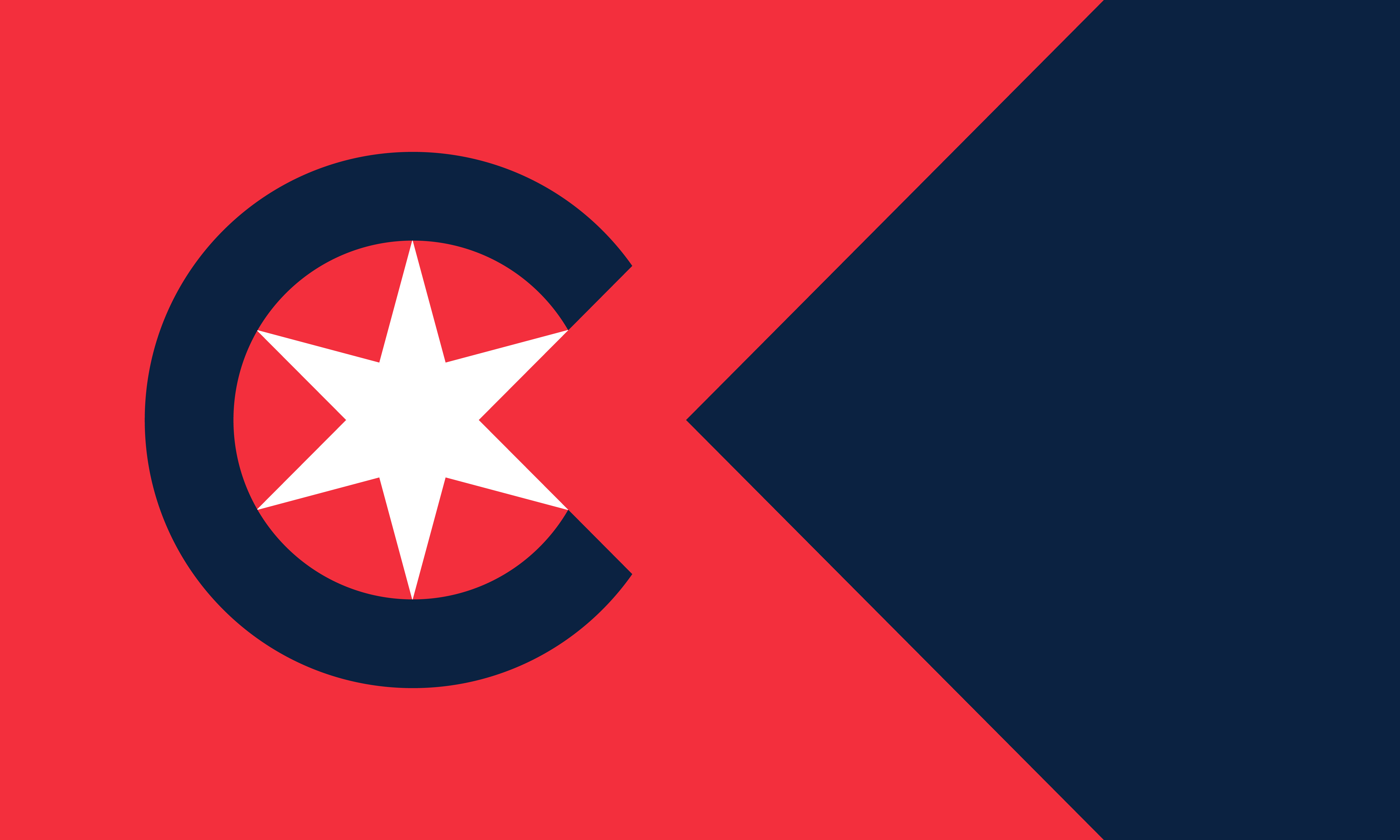
Rich in symbolism that reflects Cleveland's history and spirit. The six-pointed star honors Cleveland’s historical nickname, "The Sixth City," and nods to the current city flag’s six symbols representative of Cleveland’s industrial and nautical history. The prominent "C" stands for Cleveland, while the swallowtail-shaped red section honors Ohio’s state flag shape and opens up to the right, signaling the forward progress of our city. The blue field to the right symbolizes Lake Erie, while the blue within the “C” represents the Cuyahoga River, named “Crooked River” by the Native American tribes of our region. The red stripe between the "C" and the blue field signifies Cleveland’s Rust Belt heritage. The overall red, white, and blue color scheme pays homage to the original Cleveland flag, as well as the Ohio and U.S. flags.
Design 2
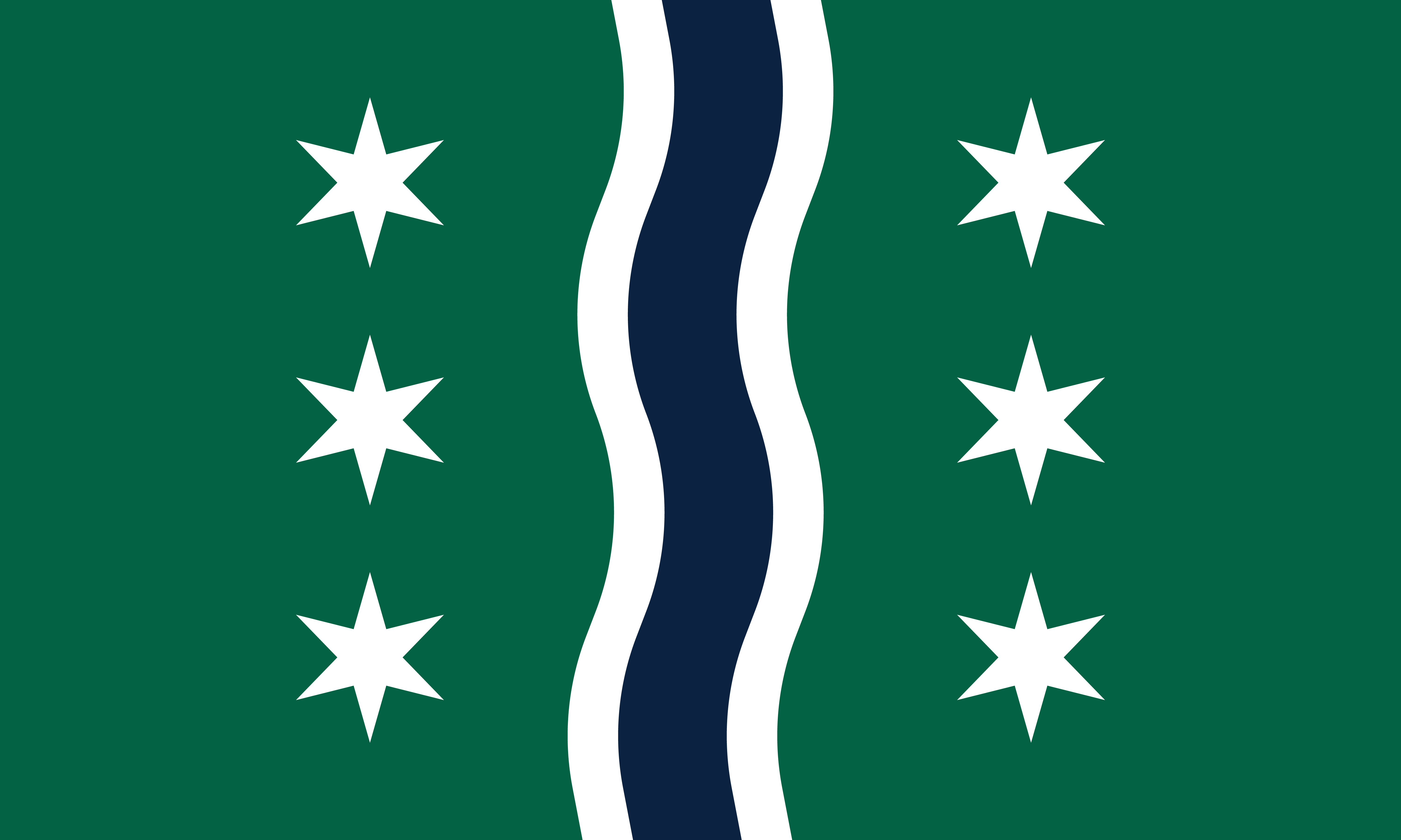
Weaves together elements of Cleveland's identity and history. The six-pointed star represents Cleveland’s historical nickname, "The Sixth City," and echoes the six symbols on the original flag, while also organized in such a way to symbolize the six tuning pegs on a guitar, a nod to Cleveland's rich rock and roll heritage. The blue wavy line represents the Cuyahoga River, named by Native American tribes in our region to mean "Crooked River." The green flanking the sides of the blue wavy line pays homage to Cleveland’s nickname, "The Forest City." The white lines in the center stand for civic virtue, tying together the city's past, present, and enduring spirit.
Design 3

Captures the essence of Cleveland through thoughtful symbolism. The six-pointed star signifies Cleveland’s historical nickname, "The Sixth City," and honors the original flag’s six symbols of industrial and nautical themes. The blue section at the top represents Lake Erie to the north of the city, while the green portion at the bottom symbolizes Cleveland’s nickname, "The Forest City," and celebrates Cleveland’s Metroparks system. The white line represents the city's shoreline and includes a wave crest pointed to the right, representing our city’s forward progress. The circle encircling the star pays tribute to the Ohio flag, connecting Cleveland to its state heritage.
In an interesting twist, and out of respect for Susan Hepburn’s design, the CLE Flag Project has added the current city flag to its list of finalists. Again, the description of the flag’s symbolism is courtesy of the CLE Flag Project.
Design 4
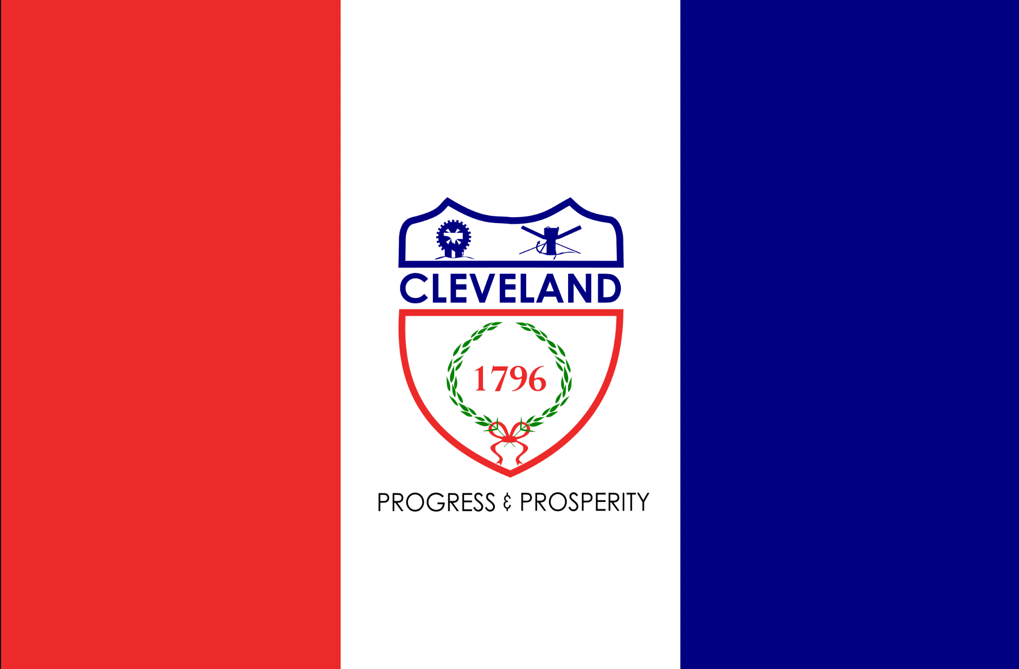
The current flag of the city contains three vertical stripes in red, white, and blue, which symbolize American patriotism. At the center of the white stripe is a shield, outlined in red and blue, bearing the city's name, "Cleveland," and the founding year, 1796, encircled by a laurel wreath. The shield's upper left corner features an anvil, hammer, and wheel, representing the city's industrial heritage, while the upper right corner displays an anchor, windlass, and oars, highlighting Cleveland's role as a commercial port on the Great Lakes. Below the shield, the words "Progress and Prosperity" were added later on, reflecting the city’s motto.
Now, CLE Flag Project volunteers canvass Greater Cleveland to make people aware of the flag designs and how they can share their opinions. Volunteers ran a booth at the recent Feast of the Assumption Festival in Little Italy, and fliers have been placed in Cleveland Public Library branches around the city. The organization is also promoting the voting process on its social channels.
Anyone interested in voting can go to www.cleflag.org and click on the “Vote for a New City Flag” button on the homepage. You do not have to live in Cleveland proper to vote. In fact, you can live anywhere in the world. The idea is for anyone with a history in Cleveland, a fondness for Cleveland or an interest in a new symbol for Cleveland to have a say. You can vote as many times as you like.
Once you fill out some initial demographic information, you are taken to a page where you rate each flag on a scale of 1 to 10. After that, you are asked this question:
“After reviewing the three new flags in addition to Cleveland's current flag, do you think that the city of Cleveland should adopt a new flag? A ‘no’ response indicates that you would like to keep the current flag as it is.”
Lachman says that final voting results will be announced sometime in September. “We want to have as much information as possible before we address City Council [with the final design],” he says.
What if voters decide they like the current flag best? “That’s great,” Lachman says. The important part is that the community will have their say.
Fragassi says that greater promotion of her great-grandmother’s design would go a long way to boost its recognition and its significance for the city. “It’s a wonderful flag with an interesting backstory,” she notes. “This contest has brought fresh awareness and understanding to what we have, and people genuinely seem interested in embracing history.”
We should find out soon what the public prefers. Even then, it won’t be a done deal. The CLE Flag Project will take its case to Cleveland City Council, and they could decide immediately or put the plan on hold. In the meantime, Fragassi continues to honor her great-grandmother’s innovation, and the CLE Flag Project continues to share its message that a new flag will represent inclusivity while still paying respect to the flag that currently flies outside of city hall.

Thank you for this thoughtful article. It is heartwarming that CLE Flag is presenting the historic flag and its creator so respectfully. As I contemplate the story of my great-grandmother, I feel she never fully got the recognition for her design that she deserved. As a young, female art prodigy, I suspect there were feelings of misogyny about her beating out several male finalists in the design contest in 1895. In 1946, during Cleveland’s sesquicentennial celebration, the flag came under attack from veterans groups stating that flying any other flag than the Stars and Stripes was unpatriotic. When I became aware of this project last May, this contest was launched, declaring the current design is outdated and unattractive. I think it would be impossible in this day and age to come up with a design that appeals to everyone who loves Cleveland. I had to block out social media these past months as my great-grandmother (who died in 1961) was being mocked and her design was being made fun of. Symbolic design is not all that easy. Now I’m seeing fresh comments stating one of these designs belongs on a Starbucks cup, another looks like a Seattle Seahawks theme Mastercard, or one flag looks like it represents the Chicago Cubs. There are plenty of opinions and misunderstandings to go around when looking at these designs, so I think it’s important that we consider all points of view while trying to determine what best represents our city. I’d like to thank CLE Flag for bringing awareness and respect to the flag that has represented Cleveland these past 128 years.
It's too bad none of the designs reflect the things I think of most when I think of Cleveland. First, the Guardians of Transportation (I know the baseball team uses them too, but they are still a really good representation), the iconic Hueletts (which now no one knows about since the last one is about to be scrapped, but for generations they WERE the Port of Cleveland), and lastly the very diverse melting pot that is Cleveland. These desings make no sense to me.